Sunday, August 12, 2012

A Radical Departure

Warren Tales is moving!

After six years in Boston—my favorite city, and a most beautiful home—it is time for me to move on. And so, I will be heading west and returning to my family's hometown and residence in California. 

Gaviota, California

As I make the move, I will be driving across the country—not simply in one route, to get across, but in something of an "S" through the north, mid, and south to finally see the different qualities and culture the States has within it: starting September 1st, and ending any time between Halloween and Thanksgiving. 

While the "American road trip" is typically steeped in vague, implausible, and unrealistically romantic expectations, which ultimately have a tendency of fizzling out into the form of a plane ticket, my trip (while certainly bolstering all of the same absurd/exciting hope and hype) will be completed mostly alone (with frequent, if not constant visits to old friends, and the occasional road tag-along), at a time in my life to which I have allotted significant time and budget in order to prevent issue. Contrived disclaimer aside: I have purchased a car, I have left my job, I have sold my furniture, I have relinquished my apartment, and I have shipped a six-year-accumulation-of-"stuff" home. Needless to say, I'm on my way!

Now, I ask you, reader, to lend me any advise you may have on what to do and what to see (or not) in any state you're familiar with (including Montreal and Toronto, if you feel inspired). I have three weeks until I roll out, and I would love to have as much region-research as I can before "winging" it. I will be camping, I will be visiting new cities, and I will be looking for a local perspective on what make those places great.

Finally, I will not be working on any original projects during this interim period, but my worker-bee brain is never turned off and I will post some fun highlights from the trip both here and on Facebook. I am however, participating in the 2013 Sketchbook Project with the Art House Co-op, producing a Travelogue across the States—marking major highlights creatively in sketch and paper-craft form, and including a selection of original or quoted writing. So be sure to check out the updates as I progress.

Thank you for everything, Boston, I'm entirely unsure of how I will drive away, but will find out soon enough. I leave you with poetry:


A Radical Departure 
by James Tate

Bye!

I'm going to a place so thoroughly remote
you'll never hear from me again.

No train ship plane or automobile
has ever pierced its interior

I'm not even certain it's still there
or ever was
the maps are very vague about it
some say here some say there
but most have let the matter drop

Yes of course it requires courage
I'll need two bottles of vintage champagne every day
to keep the morale high

and do you mind if I take your wife? 
Well, I guess this is it
we'll see ourselves to the door

Where are we . . . ?

Wednesday, August 8, 2012

Small City Chapbook Release

Warren Tales is double-dipping in creativity for the production of my new poetry chapbook!

Author Bio: Lindsey Yuriko Warriner is a shepherd of short poetry. She draws inspiration from her international upbringing, and dreams of one day writing an epic poem. She has been published by Alehouse Press, and was awarded the 2010 Evvy for Outstanding Poetry by Emerson College, where she earned her BFA in Writing, Literature, and Publishing.

 
Small City is a collection of short poems ranging in tone from whimsical, reflective, and socially curious. This chapbook was greatly inspired by the city of Boston and demonstrates this in a unique paper-cut depiction of the metropolitan downtown area, featured on the cover and title page.

   
The book measures 4 1/2 x 4 1/2 inches, and has been hand-bound with a tabbed "matchbook" saddle binding.


Each copy is numbered one through thirty out of thirty in this first edition print run.


Please see below for an example of two of the twenty-nine poems featured in the book, and contact warrentales@gmail.com with any further questions or supply inquiries. Orders will be purchased through Etsy.


Intention

If you open a bag
of potato chips
upside down,
you are in love.

There can be no other
explanation
for your distraction.


In Our Old Shipwrecked Days There Was An Hour

In the Gaviota hills, we find the final hour,
our time blown offshore by salted winds like an
old sun, waning. I was

shipwrecked in the broken underbrush. There,
days passed without a concept of days.
There, I imagined the shipwrecked

was a recital of everything old—
an exodus of memory in our
hour of expulsion. We've come, now let us in.


My book release and first reading feature took place this Monday as a part of the Stone Soup evening at the Out of the Blue Gallery in Cambridge, to a great reception—a studio packed full of friends, fellow poets, and long-time Stone Soup patrons. I read a selection of original poetry for twenty-five minutes, and not only didn't trip over my own words (or feet), but actually felt very comfortable up in front of the mic. And sold 8 copies of Small City (18 including online reservations). Take that, childhood jitters!

Thank you to Michael F. Gill for the booking, and for being a fabulous host.

Monday, August 6, 2012

An Inviting Round of Golf to Ring in Twenty-FORE!

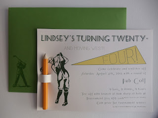
I turned 24 this weekend, and decided to celebrate with a round of Pub Golf, if only to take advantage of the prime golf-pun potential (Twenty-Fore/Four was just too good to pass up). And of course, designing the themed invitations was half the fun!

The invitation features original artwork and lots of typography lovin', with a customized scorecard on the back, and a removable golf pencil for score keeping. The envelopes then feature a vintage golfer, raised to the touch using thermography (more nerdy joy). 

I was thrilled with the final outcome--of both the invitations and the event itself--and look forward another year of craftiness!


My fabulous teammates psyching up at Hole #3:


Tuesday, July 17, 2012

Store Front Re-Launch

The revitalized Warren Tales store front is now up and running on Etsy!


The store is happy to kick-off its latest face lift with a new, hand-lettered and digitally remastered banner, and will continue to feature staple catalog items including a selection of single cards, card sets, prints, and journals. Check back often for new products and summer promotions.

 A one-of-a-kind card featuring a raised structure, hand woven with embroidery thread, and mounted on hand pressed paper.

A beautiful combination of world-wide postmarked stamps, as well as a hand typed greeting. Each card is as unique as the stamps it features.

 Simple hand bound journal, made with sturdy cover stock and waxed thread for durability. 5"x7" single signature, 32 blank page, saddle stitched journal series

Friday, July 6, 2012

Pi By Numbers

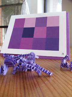
Congratulations to Justin, for graduating from the University of California, Santa Barbara with a stellar B.A. in Mathematics, and for becoming Warren Tales' first entirely digital order!


Inspired by a classic paint-by-numbers approach, these party invitations feature 12 digits of π to represent the 2012 graduate.


10 selectively chosen shades of purple, ranging from 0 to 9, applied according to each corresponding number.


Hand cut, scored, and packaged.


Congratulations Justin, on your remarkable achievement. May you fiesta with the best-a them in celebration! 

(Well aren't I just a regular puñata! Hyuk yuk yuk)

Friday, June 22, 2012

Tales of Independence

Photo by Warren Tales, entitled "Americone" because I'm punny like that

As the 4th of July approaches, I aptly announce to you my own impending independence (say that 10 times fast)...

Warren Tales is going full-time!

It has been an incredibly valuable slow-build from 2010 until now, and I am excited to say that Warren Tales has grown to a level that requires more time and attention than a part time endeavor can provide. And so, I take the plunge. I'm mandatorily terrified, yes, but with the support of everyone that has become a part of the Warren Tales experience, and its growing client-base, I have high hopes, grounded expectations, and one hell of a work ethic!

Keep a close eye on Warren Tales over the next month, and be sure to find us on Facebook, as there will be a lot happening, including yet another very exciting announcement...

Sunday, June 17, 2012

Armadillo in a Lunch Box

May marked a pretty crazy month for Warren Tales, between the 2012 National Stationery Show and...(drum roll, please)...my first official chap book order!


Chap book production is something I have had my eye on for some time now--being in the poetry community, and seeing the unfortunate (physical) quality of unpublished product--but as something to come in the future. So when Charlie Rose approached me with his manuscript, Armadillo in a Lunch Box, I couldn't have been more surprised and overjoyed (and then, you know, terrified). 


It felt wonderful to be back in the editorial process, being challenged to remember my training in desktop design, and so completely perfect to get my hands back into book binding. What a revitalizing opportunity!


Designed with recycled paper and a leading window frame, as well as hand numbered to mark each copy in a print run of 30, with reprints and an eBook edition available.


From the enthusiastic feedback of author (and client), Charlie Rose, and the members of the Cantab Lounge Boston Poetry community, I am overwhelmingly happy to announce this first order to be a success! I look forward to working on more book projects in the near future.

Saturday, May 26, 2012

Noteworthy Folk & Folkworthy Notes: National Stationery Show 2012

During my time at the National Stationery Show in New York (May 20-23rd, 2012):

I saw what seemed like an astounding number of experienced and successful stationery artists.

I heard what it is that the retailers are looking for.

I learned that Warren Tales is on the right track, and what to expect from a conference setting.

I drooled over a whole lot of breathtakingly beautiful works of everyday art, every day. It was outstanding.

As I quickly learned, most exhibitors neither have the time, nor the patience for someone who--it could be mistaken--simply feigns a personal interest in their profession; so the first thing I learned was to introduce yourself with a strict air of educational (and a hint of blogger) curiosity. Be knowledgeable. Be passionate. Be appreciative.

Below, I have featured a number of my favorite companies from the show. These people stood out particularly, for their extraordinary talent, but also for their kind disposition, and genuine interest in their customer and fan-base (AKA went above the call in humoring and indulging my questions). There are so many beautiful things in the world, and I feel like the most significant of it comes from the people that create it. 

For a succinct visual overlook of the list, including portfolio pieces from presses not featured, check out the National Stationery Show 2012 board on Pinterest for all your nerdy needs!


Albertine Press: The most beautiful letterpress cityscapes I have ever seen. Bar none. This press brings together a love of journals, stationery, postal letter writing, and even traveling, and packages it such a way that feels like a breath of relief, akin to when you find something you thought you'd lost. This press has everything I knew I was looking for. And learning that she hosts studio workshops and classes just makes me all the more happy to live so close (Albertine is based out of Somerville, Massachusetts).


Austin Press: While purchasing a card in a museum gift shop, a few months ago, I happened into a conversation with the store manager about the stationery world and business. This woman suggested that I look into something called the "National Stationery Show" in New York, coming up in May, as it sounded like I (and my growing business) would enjoy and benefit from it. I held on to that card to send specially to my mother for Mother's Day, as we both have bee tattoos, and place our own significance in the insect. Last Sunday, as I walked up to the Austin Press booth, I discovered the connection, and thanked the artist personally for being the reason I had come to find myself there that day. I am aware that this personal story does not communicate the quality of the work, or really even describe it, but if I had to summarize this press: The aesthetic flows as if it is a part of you, and only when you have it in your hands do you realize it always has been. I challenge you to own/send/receive her work and not feel the same.


Banquet Artelier & Workshop: Animal, botanical, and nautical (oh my!) screen prints to make your heart melt and your knees weak. With a catalog full of cards, prints, and even temporary tattoos, each is more delightful than the last, and none so much as the lovely ladies behind the curtain. Beautifully printed, and cheerfully distributed.


Benjamin Paul Letterpress: It was a funny feeling, walking around this great hall, striking up a casual conversation with a vendor, and then realising they create half of the work that you have lovingly and meticulously filled your apartment with. Benjamin Paul first caught my attention with their line of insect cards (Insecta), which I sent to people along with my finished B.F.A. thesis, back in 2010. Then, more recently, they floored me with their Carnivale collection of letterpress fairground postcards, which I have had on display since skipping home with them, many months ago. The owners were welcoming and soft spoken, helpful and appreciative. Simply put: they were as magnificent as their work. I cannot encourage you enough to give them a gander and treat yourself, or someone else.


Bison Bookbinding & Letterpress: This press acts as a representative voice for a collection of artists and designers, as well as producing the work of the owners. I am aware that my experience in the stationery world is just beginning, but still, I'm not sure I've ever seen a group of artists collaborating to the success that this press produces. Once again, I found myself face-to-face with the work of some of my favorite mysterious (read: fourth wall, because I clearly could have looked them up at any time but chose to believe in letterpress pixies instead) designers/artists, with the ever-attractive result of incomprehensible drooling. Karie Jane and Karoline Schnoor were my personal favorites of the featured work.

 
Coral & Tusk: A stunning example of original work. This studio creates an array of burn-cut, and tied embroidered stationery that literally stopped me in my tracks. I mean, even their business card looks like something I want to frame! Their work feels earthy and hand crafted in the way we all wish our own would turn out. Coral & Tusk does it right and makes it look easy.


Dandy Lion Press: I didn't get a chance to study the work much, or speak to the artist in person, but I still find myself so significantly drawn to this work. Stunning.


Egg Press: I've been a fan of Egg Press for a long time at this point, always admiring their innovative die cut designs, and positively cute letterpress. They are also recognizably successful enough that I don't feel like I need to "spread the word" on the high quality of their products, as I have come to expect that of them. However, what I wasn't expecting was for such an established press to be so down to earth and approachable. I had the good fortune of speaking with the designers for more than just a moment, and came away further inspired and nerdfully gleeful, still.


Eleanore Design & Illustration: I was predisposed to be a happy camper at this convention, what with all the paper, design, art, and people who also love all of these things, but meeting and speaking with this woman made the show. She was generous with both promotional giveaways (stylized iron-on puffin patch!) and her time, and really changed my initially defeated perspective on the conference. She could be seen any time throughout the week in excited conversation with both retailers and admirers, and was over all as bold and delightful as her work. She comes from a teaching background and holds strong to her own creative voice, while encouraging others to find theirs. Beautiful and lovable screen prints, galore.


Figs & Ginger: This studio didn't so much catch my eye for their woodcut cards (which are positively pretty), but for the wooden party products and their personal accessories. I've been obsessing over a tiny rabbit necklace for many-a-month, and lo and behold, they make it! And even with my own personal triumph aside, Figs & Ginger produces some of the most elegant and charming triangle woodcut bunting flags and silhouette cake toppers that are simply adorable!


Hammerpress: I didn't get much of a chance to speak with the artists of Hammerpress, unfortunately, but I continue to find myself a little floored by their thick and saturated letterpress style. Using much heavier color blocks than your typical press, these prints and cards just about jump off the wall. And, their cards run on thick stock which makes for some amazing postcards! Between the vintage designs, the stylistic look, and the vast catalog, consider me a sucker in love. I've actually had the postcard photographed above in my collection for a year or so. It's a small world--but then, I guess it is "Stationary." Hyuk yuk yuk. 


Jigsaw Graphics: This press runs a beautiful collection of letterpress household objects cards and products that I can't help but swoon for. Using bright colors and simple line art, the result is everything you look for in a greeting--thoughtful and to the point. This press also succeeds exceedingly (say that 10 times fast) with their custom "doodle" letterpress, which takes a child's artwork and turns it into a line of stunning letterpress cards--a seriously adorable approach to holiday cards or party invitations.


Left Field Cards: Hand carved lino prints as posters and postcards. The great raw aesthetic of the hand carved stamp was so wonderfully unique in the sea of letterpress that I couldn't help but stop and study the (beautifully) displayed blocks in something of a How It's Made inquisitive trance. This work is simple and approachable, traditional, and yet produced into a product that I could only see coming from this individual. Perfectly pleasant, in the fullest sense of the word.


Lettuce Press: This press stood out most to me for it's natural aesthetic. A husband and wife team; one works from a machine/industrial production background, and the other design and illustration. Together, they make a practical and creative force. They use predominantly repurposed materials for their products, including construction cast-offs for their line of block-mounted prints, and bamboo for supplemental woodwork products such as place card holders and desktop organizers. Simply put: their work leaves you feeling happy, and that's real success.


Maginating Letterpress & Design: Maginating has been blowing up with success lately, and just took home the Louis award for card of the year (see the above Bacon & Eggs card). This press thrives on whimsical letterpress, inspired by a background in children's illustration. These folks were some of the nicest people I met at the show, which makes me all the more excited for their great accomplishment. 


May Day Studio: I would like to make special note of the strength of this studio's work with patterns. I had the wonderful opportunity to talk somewhat at length with the artist (who kindly humored me as I repeatedly stalked the area surrounding her booth) and hear the back story behind their inspiration: hurricane floods and the changing face of her home state in the aftermath. The aesthetic flow of these repeating patterns brings the elemental structures to life, both as gift wrap and as stationery.


Oddball Press: Magnificently quirky letterpress cards with notable line art envelope accents for additional "wow" factor. Wow, indeed. What a brilliant combination of design and imagination, wrapped up in what I can only hope is--and continues to be--rip-roaring success. Amazing product from an amazing press.


One Canoe Two: This press is what happens when you mix charming illustration with whimsical commentary. The above pictured "Things That Are Long" print is one of many products that boast of a sense of humor, as well as phenomenal design. This press has a growing catalog of beautiful pieces that belong in the homes and hands of many. Amazing work.  


Paper Boat Studios: Design done right. That is what I have to say about Paper Boat Studios. If you're not jumping with joy for their illustrated origami line--the most elegant and over all best of it's kind that I've seen to date, might I add--then you will be blown away by the Spirograph-esque beauty of their patterned cardscapes. Letterpress is wonderful, but these designs outshine their own prints. 


Papillon Press: This press has an incredible level of talent for illustration. With a style so distinctly their own, they raise the bar on vintage aesthetic with their creative and simply gorgeous card series'. I'll admit that I'm a sucker for circus side shows, but seeing it blazoned so brightly in beautiful letterpress will have me making this particular collection my own. Papillon Press will be seeing more of me, and I bet they'd love to see you, too.


The Regional Assembly of Text: I have been following the company--completely unknowingly, of course--for the last few months, with growing admiration. They share a similarly painted aesthetic with Rifle Paper co., which is what initially caught my attention about them, but have such a unique voice. From the welcoming line of their website ("We are so happy you found us."), to their magically sweet and simple--but not at all saccharine or repetitive--illustrations, they are a friendly and fun, and a fast favorite.


Rendij Studio: Based in Los Angeles, this studio brings the night sky back to the city. The featured moon calendar is unlike anything I've seen before, and so clear and meticulously letterpressed. Stellar work...teehee.


Rifle Paper Co.: Stunning. Always. Anna Bond continues to blow the country away with her darling illustrations and straightforward message: Thinking of you. Rifle's work and growing success clearly speaks volumes for itself. 


Sesame Letterpress: Beautiful vintage line art and portrait designs that utilize phenomenal pattern work. Their use of thin paper stock is particularly effective for such products as their letterpressed calendar, evoking distinguished elegance.  


Wildhorse Press: At this point in the post, I have already used the words "beautiful," "amazing," "marvelous," "gorgeous," and "wonderful" more times than is necessarily okay, but that's just what the work of this press is. I can only imagine that building up from the natural talent of the super friendly and enthusiastic owners was harder than they make it look, but you'd never know it. These girls are an asset to the industry, and I look forward to seeing how they continue to grow.


Notable Mentions:


Belle and Union: These bold single color prints look amazing on a card, gift wrap, or tea towel.


Dingbat Press: Cityscape cards and monogram single-signature pocket journals. 


Enormous Champion: Bold color prints and cards that pack a punch of personality.


Fat Bunny Press: Stinking adorable letterpress. Seriously.


Flywheel Press: Orchestrated the Matchbook Scavenger Hunt promotion, in collaboration with 16 other presses, and Legion Paper supplier. Look out for the upcoming "Classic Moments" card series, featuring letterpress renditions of iconic movie scenes from such films as Sixteen Candles, Casablanca, and more.


Fresh Frances: Widely distributed printed cards with a popularly punny sentiment, based out of Chicago. Owned and run by a wonderfully friendly--and increasingly successful--woman.


Moglea: Ever-charming typography and illustrated stationery.


The Nic Studio: Illustrated letterpress a cut above the rest. Original and innovative designs make these cards feel like the event, rather than just the invitation.


Pepper Press: Beautiful color and blank (no ink) letterpress designs, and phenomenal geography cards.


Pistachio Press: Saturated colors make these simple designs pop off the page.


Revolver Journals — Based on the mechanism of a Jacob's Ladder toy, these journals make use of a revolving split spine to allow you to flip not only the outside color/design of the journal but also the orientation of the pages to either ruled or plain paper. Exceedingly clever engineering from a truly lovely woman, and so I felt the need to mention and further share them.


Ruchi Design: Graphic greetings from a two-time team of twins. A fabulous duo on and off the clock.


Sweet Bella, LLC: An innovative line of bookbinding and stationery accessories, as well as stitched postcards from around the world. 


This Paper Ship: Husband and wife team of illustrated whimsy. Light-hearted and sweetly stated.


Tilia Press: Eco-friendly, nature inspired greeting cards created by a wonderful and creative woman. Such a pleasure, having a chance to see this line, and meet the owner. I look forward to watching this company grow (no pun intended, but always appreciated).


A special thank you to all of the talented and welcoming artists at the National Stationery Show 2012, for speaking with me, and for making an example of yourself for future stationers. I walked away from the show with everything I had hoped to find, and more, and I have all of you to thank for such a pleasant and beneficial experience. Best of luck in everything you're working toward, and I hope to see you again in the coming years--in time, from the other side.
 
[Note: I was a little sheepish about taking pictures at the show, what with my very much still working up to being A (let alone The) new kid on the block, so the majority of the featured booth photographs have been repurposed from my definitively favorite paper blog, Oh So Beautiful Paper. All photo credit therefore goes to Nole Garey. Product shots are otherwise linked to the artist's site, itself, and so all credit for these obviously belongs to the corresponding artist. Gotta give credit where credit is due!]