Showing posts with label Portfolio. Show all posts

Tuesday, April 1, 2014

National Poetic Card Writing Month


April is National Card and Letter Writing Month! It's also National Poetry Month, which makes April a combination of my two favorite things and essentially the best month of the year.

To start, here are some letter-writing challenges to try your (soon to be cramped) hand at:

I am running a hearty #365daysofletterwriting challenge, broadcast on Facebook and Instagram, as a continuation of Fawnsberg's original #60daysofletterwriting. Today will mark Day 91 of 365, if starting from January 1st, but I happily encourage setting your own partial challenge and joining the community under the #365daysofletterwriting tag, or trying for a year from a start date of your choosing!

Egg Press and Hello!Lucky have teamed up to encourage the art of letter writing with a 30-day challenge entitled (and tagged) #WRITE_ON, beginning today. Hello!Lucky will be hand-selecting Instagram posts featuring that hashtag (#WRITE_ON) throughout the month to feature on their blog, while Egg Press will be sharing letter writing ideas with those who follow their Facebook and Instagram accounts. To get the most out of your month of letter writing, get your beautiful and free letterpressed starter kit here (while supplies last).

As for NaPoWriMo (National Poetry Writing Month) challenges:

If you're looking to dabble, NaPoWriMo does a daily poet feature and prompt, among others, and there are several Poetry Month prompt pages to follow on Facebook, including 30 Day Poetry Challenge.

For an epic writing month (pun intended), check out Poetry Foundation and Poets.org for their excellent resources, including social media prompting and fun extras like Poem In Your Pocket Day on April 24th (I'm telling you, this is the best month of the year).

If you're feeling particularly bold and literary, why not combine the two occasions and join me in a (probably very masochistic) Poetic Card Writing Month! 30 days of hand-written cards or letters which include an original poem. For real. Use the hashtag #poeticard on Twitter, Facebook, and Instagram, to share your poetic prowess and most importantly have fun with it! Even if a full 30 is out of reach, give it the old liberal-arts-college-try and see how far you can get. You can certainly count on some some sleep-deprived pearls of goofdom from yours truly. I will be reposting and sharing my favorites from people throughout the month, and I'll even throw in a FREE Warren Tales card or writing paper set (of their choosing) to my favorite #poeticard at the end of the month!

You can buy lots of lovely and versatile cards for all your non/poetic letter-writing needs over at the Warren Tales shop via the website or Etsy, with lots of new designs going up within the month (keep an eye on our Facebook feed for release updates), and even get 10% off when you shop with the coupon code "LETTERWRITING".

All in all, there's a lot to look forward to this month and I hope you'll join in on the festivities! Please take a moment to share this with your friends so I can entice them with my overzealous charm and get this ballpoint rolling : )


And just to clarify, this is NOT an April Fool's Day joke...I really am this nerdy

Sunday, March 23, 2014

Boston Strong As Ever

Boston is a lovely city, like many other simply wonderful and enjoyable places, but I've never quite been able to explain the deep resonating loyalty and family that comes with calling it home. It's a phenomenon that I've found in many current and past residents, and one that is rarely spoken about because it is strangely understood. Perhaps it's the camaraderie that comes with trudging through another winter—but Boston's aren't the coldest. Perhaps it's a boiling of the brain through stifling summers—but Boston's aren't the hottest. In my experience, Boston is happiest when it's rallying its support—trying its hardest—and revels in falling short because that calls for louder cries next time. And there is always a next time. But rather than a city of losers, this is Title City! Good sports, good arts and culture, and even good smarts. Boston is a city of people talking to one another; finding common ground and interacting with their surroundings. It is an experience largely the same across utterly different demographics.

I've had the pleasure of creating two successful Boston prints in the past, a typographic Marathon Route Map being one of them, and this year I'm proud to have worked with some upcoming runners to adapt the print and produce thank you cards to share with their supporters.


I love working with this design and I look forward to developing it further in the future. As for right now however, while April 21st' marathon is getting closer, there is still time for a few last-minute orders if anyone is interested. Just email me at warrentales@gmail.com for more details.

On April 21st, thousands of people will run the Marathon as usual, spurred on by millions of viewers as usual and that strange but ever-present feeling will reassert itself in the lining of all of them. Enjoy it, Boston. You've earned it.

~~~~~

The inspiration for this post came from a Boston.com article about a photography project organized by Lucie Wicker, called “Why I Run: A Boston Marathon 2014 Project” which I think does a wonderful job of capturing the spirit.

Saturday, March 1, 2014

#60daysofletterwriting

Encouraged by Fawnsberg's brilliant 60 Days of Letter Writing project, today marks my 60th consecutive day, and the close to many peoples' winter challenge!

Here's a quick look back at the last 60 days:


For the duration of the project, I mailed or hand-delivered a hand-written note each day, and then posted a picture of the card/postcard/letter to Instagram, Facebook, and Twitter under the supplied #60daysofletterwriting tag in order to contribute to the greater project. It was brilliant! Posting the pictures not only held me accountable and kept me on track, but created a sense of suspense within my social media community (who's mailbox would the card be delivered to?) and acted as my voice within a larger conversation. 

While participating in the project, my favorite part was forcing myself to articulate why I missed a person, and why they are so dear to me in the first place. The most challenging and satisfying aspect of this was on Sundays, when the post offices were closed: I had to really consider the people in my physical community—the people I grew up with and see on a daily basis—and articulate how I felt about them; how much they mean to me. It was an excellent exercise in gratitude, and one that I am indeed grateful for. Immediately, I had so many genuine and loving things to say to so many people, and I knew that 60 days would only scratch the surface. 

Which brings me to my next challenge: I have loved participating in this project so much that I am expanding the project to #365daysofletterwrting!

On the one hand, I have no idea if I'll make it through a whole year without faltering (especially when you have to accommodate travel and access to people/post offices), and on the other, I know I have 365 reasons to tell people I'm thinking of them, so I say bring on the challenge! With Warren Tales developing so many new designs this year, being exposed to so many new (and old) people and presses thanks to the National Stationery Show (Booth #1357), and diving into this ultimately-new career and community, it is the perfect time to share my products and highlight the products I love from others.

So follow us on Instagram and/or Facebook to keep up with—an even participate in!—this new #365daysofletterwriting challenge. I will be looking forward to meeting all of you through your contributions, and possibly even to mailing you a letter of your own.

Happy snail mailing!


P.s. I am going to be focusing my Twitter account on more text-based commentary, and so will not be posting about this project. While a picture may say a thousand words, I'm going to stick to and have fun with my allotted 140 characters, which certainly promises some interesting kernels of the peculiar. I hope you'll take a moment to check out my page @WarrenTalesMail and follow me if you enjoy happy banter and stationery musings : )

Wednesday, February 19, 2014

Hundreds of Celebrations

Congratulations to the San Diego Public Library and the Library Shop for completing their first one hundred days of business! To celebrate, the SDPL is hosting a special event to honor the library's supporters, and will be distributing two hundred customized mini prints by yours truly! These limited edition Warren Tales prints feature an original paper-cut design of the building's distinctive architecture and mirrored dome, and are printed in teal to highlight the library's branding. 


I'm super pleased with how the cutting and prints turned out, and can now add yet another reason to my list of reasons to love this establishment. Here's to many more days of open doors, and the best of luck with their fabulous event!

Friday, January 25, 2013

Roadyssey & The Sketchbook Project

After such a great experience participating in the Chronicle Project, I couldn't wait to color my hands dirty with the 2013 Sketchbook Project:
 
The Sketchbook Project is a collection of creative works in the form of sketchbooks that are contributed by individuals from around the world. Thousands of people are adding their voice to this project annually. Together, they have formed a library of over 22,000 sketchbooks from over 130 countries and growing.
 
My submission to the project, entitled ROADYSSEY, is an illustrated account of my cross country road trip, during which I drove 13,000 miles through the quiet routes and back roads of Massachusetts, Maine, New Hampshire, Vermont, New York, Ontario (Canada), Pennsylvania, Ohio, Michigan, Indiana, Illinois, Wisconsin, Minnesota, Iowa, Missouri, Kentucky, Tennessee, Georgia, North Carolina, Virginia, Maryland, Delaware, New Jersey, South Carolina, Florida, Alabama, Mississippi, Louisiana, Texas, New Mexico, Arizona, and California phew!
 
Take a look at the following pictures to see how it turned out, and visit a tour event near you!

Davis Avenue in Brookline Village, Massachusetts

Nation-Wide Wildlife Sightings / Boston, Massachusetts

Boston, Massachusetts

Cambridge, Massachusetts / Acadia National Park, Maine
 
 White Mountains, New Hampshire / Ticonderoga VermontNew York

Upstate New York

 Detroit, Michigan / Cleveland, Ohio

Baraboo, Wisconsin & St. Paul, Minnesota / Commentary

Whiting, Indiana & Chicago, Illinois / The Mississippi River

Starved Rock & Matthiessen State Park, Illinois / 
Metropolis, Illinois

Nashville, Tennessee / The Blue Ridge Parkway

The Appalachian Trail / Washington, D.C.

New York City / North Carolina

Batesburg-Leesville, South Carolina / St. Augustine, Florida

New Orleans, Louisiana / Houston, Texas

Albuquerque, New Mexico

Arizona / California

In Conclusion / Nation-Wide Road Kill Sightings

The End

Thanks to everyone at the Brooklyn Art House for their endless supply of creativity, patience, and organization.

Monday, August 6, 2012

An Inviting Round of Golf to Ring in Twenty-FORE!

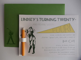
I turned 24 this weekend, and decided to celebrate with a round of Pub Golf, if only to take advantage of the prime golf-pun potential (Twenty-Fore/Four was just too good to pass up). And of course, designing the themed invitations was half the fun!

The invitation features original artwork and lots of typography lovin', with a customized scorecard on the back, and a removable golf pencil for score keeping. The envelopes then feature a vintage golfer, raised to the touch using thermography (more nerdy joy). 

I was thrilled with the final outcome--of both the invitations and the event itself--and look forward another year of craftiness!


My fabulous teammates psyching up at Hole #3:


Friday, July 6, 2012

Pi By Numbers

Congratulations to Justin, for graduating from the University of California, Santa Barbara with a stellar B.A. in Mathematics, and for becoming Warren Tales' first entirely digital order!


Inspired by a classic paint-by-numbers approach, these party invitations feature 12 digits of π to represent the 2012 graduate.


10 selectively chosen shades of purple, ranging from 0 to 9, applied according to each corresponding number.


Hand cut, scored, and packaged.


Congratulations Justin, on your remarkable achievement. May you fiesta with the best-a them in celebration! 

(Well aren't I just a regular puñata! Hyuk yuk yuk)

Sunday, June 17, 2012

Armadillo in a Lunch Box

May marked a pretty crazy month for Warren Tales, between the 2012 National Stationery Show and...(drum roll, please)...my first official chap book order!


Chap book production is something I have had my eye on for some time now--being in the poetry community, and seeing the unfortunate (physical) quality of unpublished product--but as something to come in the future. So when Charlie Rose approached me with his manuscript, Armadillo in a Lunch Box, I couldn't have been more surprised and overjoyed (and then, you know, terrified). 


It felt wonderful to be back in the editorial process, being challenged to remember my training in desktop design, and so completely perfect to get my hands back into book binding. What a revitalizing opportunity!


Designed with recycled paper and a leading window frame, as well as hand numbered to mark each copy in a print run of 30, with reprints and an eBook edition available.


From the enthusiastic feedback of author (and client), Charlie Rose, and the members of the Cantab Lounge Boston Poetry community, I am overwhelmingly happy to announce this first order to be a success! I look forward to working on more book projects in the near future.

Sunday, May 13, 2012

Special Delivery

There's a new baby in the family, and some new cards on the table. Welcome Gavin Sean! A set of vintage air mail, custom postmarked birth announcements for a beautiful baby boy.


Digitally designed and printed, and inspired by the amazing postmark tutorial by Fuzzimo.


Happy Mother's Day, Jenn and Elizabeth, and welcome, Gavin!

Ped-Antic at the Art House Co-op

Warren Tales will be participating in The Chronicle Project with the Art House Coop!

The Chronicle Project challenges artists to document a single day in their lives and share it with the community. 24 hours. 1,440 minutes. Or 86,400 seconds — to keep track of something specific, like every sound you hear, or attempt to capture your overall impression of a day. The resulting chronicles will be exhibited in the Brooklyn Art Library and collapse 1,000 unique days into one.

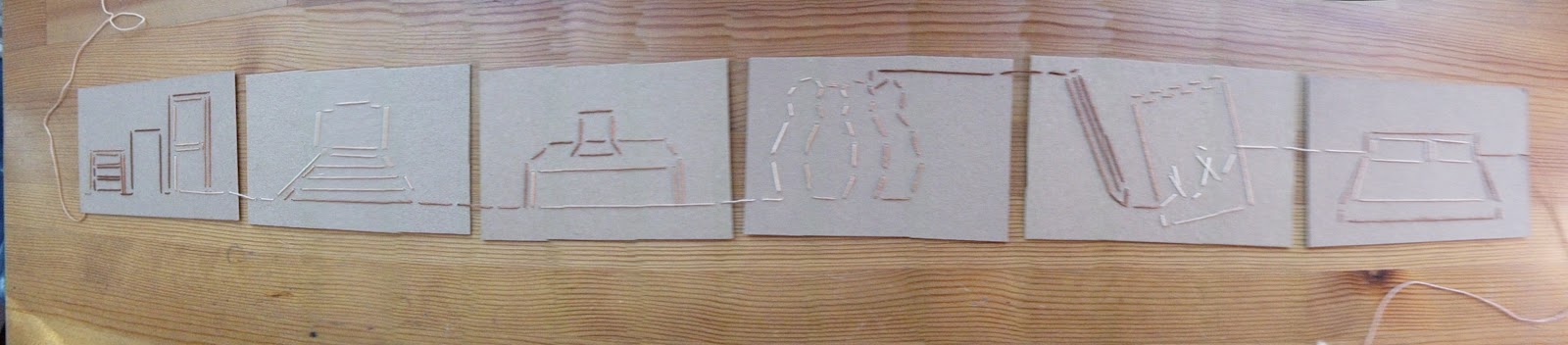
Lately, I've been on something of a walking-bender, and I wanted to incorporate that into my project. Basically, I bought myself a pedometer for my birthday, last year, out of curiosity to see how many miles I naturally clock, and my questionably-obsessive chronically has revealed over 140 miles in the last month! Crazy (clinically so, you might even say). So for my chronicle, I broke down a 24-hour period into steps and miles, over six panels: Getting ready; Morning commute; Work day; Evening commute; Hobbies & fun; and Bed.


Once I had lived out my day and taken notes on all the various things I saw and did, I illustrated the panels with a representative image for each segment. In order to express a sense of connected ongoingness--and in a way that embodies the style of Warren Tales--I sewed these images into resized upcycled card with a single, 6 yard length of embroidery thread. Each image/panel is connected by this thread, as was my day by my steps.


The project used zero knots and, again, only 1 continuous piece of thread (with a length left at each end to symbolize the day before and after this one). The panels feature images of dressers/doors; an approaching train; a desk/computer; a crowded subway car; a pencil and paper (for my writing group that I participated in that night); and a bed.


By making small divots, rather than back stitching, it allowed a cleaner, more continuous line, and resulted in an almost braille-like raised pattern on the back of each card. And within this pattern I added some illustrated footsteps to help get the message across, along side the number of steps and the mileage up to that point in the day: Getting ready 381 steps, 0.18 miles; Morning commute 1273st, 0.62mi; Work day 4430st, 2.16mi; Evening commute 5454st, 2.64mi; Hobbies & fun 13015st, 6.36mi; and Bed 13100st, 6.4mi.


Finally, the extra leads on either end allow the whole kip and kaboodle to fold up and tie together flat! And so, fun and pretty project, I call thee "Ped-Antic". . . get it? Teehee

Thank you Art House, see you again this Fall for the 2013 Sketchbook Project!

Saturday, April 21, 2012

Cut Street City Beat

I have a lot of respect for artists with the patience, and attention spans, for paper-cutting. If my mind had the literal capacity to be blown by intangible thought, (that would be unfortunate, but also,) it would be splatter-bound for the spectacular work of individuals such as Peter Callesen, or Elsa Mora.

As I take on new projects, I particularly enjoy challenging myself to new mediums, or styles that I'm unfamiliar with. This keeps my creative mind active and really feeds my love of learning, while leaving me (and my client) with the grand satisfaction of having created "my best work, yet!"

So when I came across Studio Kmo's hand-drawn, hand-cut city cuttings--I was flabbergasted by the incredible detail and astonishing beauty of each piece, first off; but then--I felt strongly compelled to give it a try.


Illustration has never been my strongest skill, and I wanted to keep the cost of the piece much lower, so it would be affordable for people, well, like me! And you! (Not that it's hard-knocks or anything, but it's nice to mix up the ramen noodle diet now and then.) So to accommodate that requirement, I turned to street maps: Google for small-scale, and fold-out road maps for large-scale.

The cutting itself when surprisingly quickly, and felt (even more surprisingly) satisfyingly therapeutic. But then, I do kind of nerd-out when it comes to paper. And stamps. And ink. And design...yeah.


Those of you holding beans in your heart will quickly recognize the distinctly-shaped common in the bottom left as the one belonging to beautiful Boston. The wharf is also quite pretty, with just the ground-level roads showing.

This print  was cut on a fine quality superfine soft white paper, 8" x 8" including the boarder (6 1/2" x 6 1/2" without), and went to a lovely ex-Bostonian, expat living out in Los Angeles.

I hope people enjoy seeing these prints as much as I enjoy making them, because I'd love to see some of those cities to the right come to life.

Wednesday, February 22, 2012

Sky's the Limit for a Baby-to-Be

Spring is approaching, and with it, adorably big-eyed and chubby-cheeked babies, and the baby shower invitations they rode in on.

Since my success in painting with wine (not to mention the sheer fun of My Dunk Valentine), I've been branching out from the consumable and experimenting more with actual paint-based watercolours. I have also been spending more time taking on digital print orders, which have been a lot of fun (InDesign and Google Analytics will have to battle it out for my heart). Put them together and what do you get? Bibbidi-bobbidi-beautiful digital watercolour flat cards. Now all I need are jolly blue robes to wear so I don't look silly while I saunter around the "shop". . . 

To get that image out of your head, take a gander at the finished products, below! 

Little Mr.


Watercolour base pages: The sky may have been done with paint, but old habits die hard, and I couldn't get enough of the naturally antiquated colour of tea, so I went pinkies up for the banner. The next step was to scan these pages in and pull them together digitally. Then, I could set the type to follow the curve of the banner, and by inserting negative space, I used the lack of colour to bring out the textured paper and make clouds (see below).


 Next came the army of hand-cut, antiquated paper planes: For consistency, I got the image the way I wanted it, mirrored it (so that the printed line would be on the back of the paper and still face the direction I needed), and then printed a sheet of them onto red card stock. I also did myself a favour and bought a new pack of blades, and replaced them each time the very tip broke off--which, for the record, happened about every seven planes. Using a clean edge really made all the difference in the quality of the cut, and the quality of my sanity by the end of it.


I brought it all together by attaching the little prop plane to the invitation with a mounting square, so that it would be raised up from the paper, and sewed a link of embroidery thread (also in the running as my one-true-love. . . now that I think about it, my heart seems to be a little slutty) between the end of the banner and the plane, to give it some texture and an movement. Lastly, I whipped up some custom return address labels, featuring "A Special Delivery From" in the official USPS font, and the same little red plane to tie the envelope and the invitation together. As a bonus, I threw in some vintage air mail stickers that I pulled together from some images online.


One of my favourite parts of finishing a custom order is being able to wrap each bundle up with a personalized band, featuring the names of the recipients. For these announcements I decided to showcase the first names of the parents-to-be on either side of their baby-to-be's.

Little Miss


Watercolour base pages: Painting an elephant becomes all the more difficult when you first have to teach yourself how to draw one, but I was really pleased with how the little stuffed-animal-esque illustration came out. Then, just like before, I scanned the pages in and pulled them together digitally.


For something a little extra, and to make use of the freedom that digital allowed me, I curved the text to fit the curve of the balloon.


 And once again, before no time at all, the invitations were printed, cut, and I'd reached my favourite part, and this time with the baby-to-be's full name.